See, I was going to originally title this "Apple's Secret Theme Tool!!", in an effort to clutch your e-eyeballs dramatically. (I've gotta get this here vortal to be more sticky!) Unfortunately, a public patent filing isn't exactly "secret". And this is all about one of the most interesting Apple patent filings I've seen lately.
Well, interesting to me, anyway. My job has been heavily user interface design-tastic these days, and I'm also personally (and perhaps unhealthily) obsessed with the concept of resolution independence. So when Macsimum News posts a story about a Apple patent regarding a resolution independent user interface, my nerd-senses start tingling faster than an morning shower with Dr. Bronners. (Except without the crazy-ass text.)
First, if you're super curious, download patent filing itself, courtesy USPTO. I've made it into a nice PDF for you:
Resawhosa Indewhatnow?
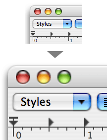
Scaling in 10.4 is chunky. Not for long?
Now, if you were to use today's Mac OS X on that display, everything would be really tiny, because a button can only be drawn at one, fixed size. More pixels, with fixed (72 DPI) controls, equals tiny town, i.e. Aqua Villechaize.
A long term solution is needed, one that all OS developers are looking at: a user interface that can scale at will. A resolution independent interface, even. Have an Apple High-DPI MegaCinema Display? No problem. Just scale the user interface to twice its regular size. Every single button, title bar, piece of text and scroll widget draws itself at a new size. The result is silky smooth — beautiful buttons, beautifully clickable, and beautifully high-resolution. That's the idea, anyway. It just needs to, you know, be programmed.
If you were to do this today in Mac OS X 10.4, the user interface would look pixelated (and you can do this using Quartz Debug) — graphics are just doubled to twice their size. That's because the Mac OS X UI is still rooted in Mac OS 8 days, defined by a series of resource files (!) and bitmaps. There's just no space in the crusty old format for "bigger sizes", let alone "flexible sizes".
Apple's Fascinating Plan
Now, if you were to ask me how to solve this problem, I would have said: "just create a bunch of graphics for each of the different DPI settings! Done!". So you have your 72 DPI button, and your 288 DPI button, etc. Multiple copies of everything. (In fact, this is largely what developers will have to do, in many areas.) And this is why I'm not an Apple rocket doctor.Here's the deal with this patent: Apple's approach seems is far more interesting, and ultimately more amazing. In essence, they're creating a user interface that's completely programmatically defined. I.e., not an exported series of graphic resources, but a series of instructions that define how the graphics should be drawn, from the ground up, just like you might create a graphic in Photoshop, all the way from "Create New Document" to "Add Drop Shadow". That means that talented Apple artists can sit down with a special internal tool — not Illustrator, not Photoshop — and craft the user interface of their dreams. And when it's time to scale it, meanmo! It just, theoretically, works, because each element is made of a series of layered, defined steps. New, higher resolution versions are instantly rendered based on the original (XML?) specification. Essentially, Apple has invented a scaleable hybrid vector/bitmap user interface that is created and edited by their own full-featured graphics tool. Phew! This is, as far as I know, a total first in the industry.
And did I mention this patent names Mark Zimmer as its inventor? You know, the guy who freakin' created Painter? Yow.
The Theme Tool
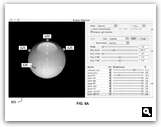
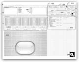
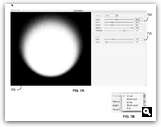
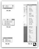
Far more interesting to me than the words in the patent were the pictures in the patent. Of course, we all know by now that Steve Jobs isn't too keen on allowing Mac OS X to switch themes, for a lot of reasons I can understand.That makes these pictures all the more interesting — these crappy screenshots of Apple's internal theme creation tool, presumably being used right now to create the next great UI. Put simply, this may be the first and last time you'll ever see this thing.
Check it out — full-featured is an understatement. (Download the .pdf for more.)
So, this is some intense technology.
And if I were a betting man, I'd say we're going to see the fruits of this labor very, very shortly. It looks like Apple now has the tools to create a user interface for the future — all that's left is to see what the future actually looks like.


